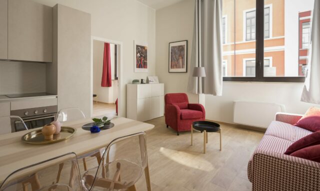
If you prefer spaces full of air and light, appreciate clear geometry and clean lines, and don’t like rooms cluttered with furniture and decor elements, there are high chances that you are a fan of minimalism.
Natural materials
Minimalism “recognizes” only natural textures. It is better to use concrete, stone, wood, metal, glass in decoration. Wood is especially often used. The wood texture cannot get boring and at the same time adds cosiness and naturalness to the minimalist interior.
Modern minimalist interiors often use large panels of white marble with textured grey veins. Elements made of warm-coloured metals add comfort. Bronze or brass will fit perfectly here. In bathrooms between marble tiles are used not grouting, but metal inserts.
Colour
Cool white colour is not the best variant for a background. Better to use a warm white, milk-like with a drop of coffee. Nordic designers often mix a little warm yellow into white plaster or wall paint to make the shade feel homey and glow from the inside.
Minimalism is a striking style in itself, usually built on the contrast of shades of white and black. It is worth thinking carefully before adding a coloured spot to such an interior.
So for your minimalistic apartment to not look gloomy and boring, you need to work with textures, shapes, graphics, play on the contrast of matte and glossy surfaces, add wood, glass, and metal, pay attention to the lighting that will set the right atmosphere.
Lighting
It should be different but preferably in warm tones, it should meet greatly all the everyday scenarios of the apartment. In minimalistic interiors particularly lighting is used for space zoning. Typically, there are overhead flooding lighting and local lightings for reading or conversation with your guests.
When you will design lighting, which, among other things, affects the perception of colour in the interior, strive to make lamps invisible. The light source should be directed to a surface that reflects the rays and as a result gives them a new shade. However, if you want to get an additional element in the room that works as an art object, you should not hide the lamps.
Storage of things
Minimalism does not imply finding household utensils and decorative elements in prominent places. You need to think about storage areas. Ideally, it is better to allocate a separate room for this. But if the area and layout involve only cabinets, they need to be “dissolved” in the room. Plasterboard boxes will also come to the rescue.
Furniture
When choosing furniture, give preference to simple shapes. Laconic textured furniture, usually built-in, custom-made. Minimalism does not imply fittings, handles, and decorative details. Handleless furniture doors are complemented by special Click on spring mechanisms.
If it is not possible to equip a dressing room, for storing things, make a built-in wardrobe in a niche with a finish that would merge with the walls, and invisible doors that can be painted in the colour of the walls or neutral, and without additional decor.
Smooth facades of kitchen furniture in this interior, as a rule, are plain or contrasting, without additional decor such as chamfers and decorative handles. An interesting trick is a kitchen in the closet: you open the doors – and in front of you is a full-fledged place for cooking, which is hidden if necessary.
As for household appliances, in minimalism they should be built-in – this is especially true for kitchen furniture.
Furniture-transformer is suitable for a nursery: these can be models with a bed that retract into the wall. The desk can also be stowed away in the closet. It is worth considering a storage system for toys – it can be pull-out cabinets or modules in a closet, boxes on wheels.
To find furniture in this style you can go to Homey Design Store.
Laconic accents and textiles
If you don’t want minimalism to appear impersonal, accents are needed. You can decorate one of the walls with graphic paintings, or photographs.
Minimalism prefers large forms in decor: when choosing vases and sculptures, give preference to large sizes.
Textiles (curtains and bedspreads) must be selected so that they do not stand out, but dissolve in the interior, match the shades of the walls or furniture. Blinds are suitable for window decoration; parchment-thin roller blinds installed on the frame itself; traditional roller blinds made of thicker fabric, rolled over the window, and drapes.
Errors and misconceptions
There should be no feeling of crampedness in a minimalistic interior. You shouldn’t embody the idea of minimalism in a typical small apartment. The aesthetics of minimalism asks for air – it needs large windows and spaces. That is why minimalization is more often used not in residential, but in commercial real estate: banks, restaurants, hotels and business centres.
In minimalism, there should not be a sense of darkness either: special attention should be paid to working with light. The main focus is on natural light. To enhance it, reflective (glossy) furniture surfaces, glass, and even glossy self-levelling floors are often used. The windows are left open to the maximum.
A minimalistic interior should not have cheap materials and furniture. One of the key misconceptions: minimalism is simple and cheap. In a laconic space, furniture is accent and eye-catching.
And of course, you should not allow littering, you need to remove all unnecessary items that do not carry a functional purpose. Decor and visual clutter are also kept to a minimum.
Images via Unsplash

