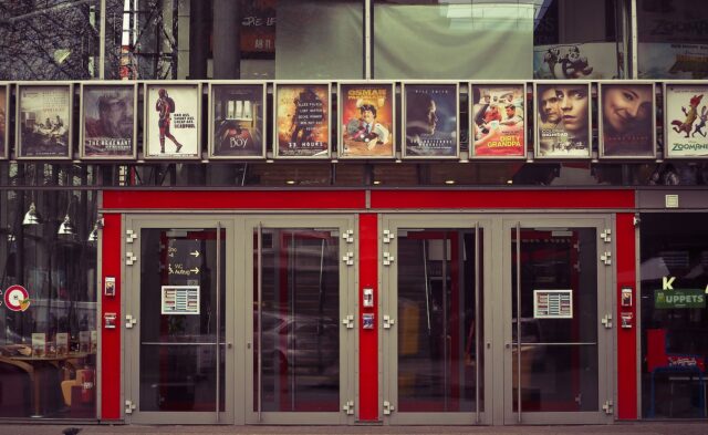
A striking movie poster can captivate audiences and draw attention to a film like nothing else.
With the right imagery, fonts, and composition, a well-designed poster can really excite viewers about the movie. As contemporary art characteristics evolve to become more experimental and boundary-pushing, here are the eight key tips for creating an eye-catching, effective movie poster:
1. Know Your Audience
The first critical step in designing any impactful movie poster is thoroughly understanding exactly who your target demographic and audience is. Cinema often has cross-generational and widespread appeal, but you still need to identify the primary age groups, backgrounds, and preexisting interests of those who most want to attend your film. Determine their preferences and psychographics – what visual communication styles and poster aesthetics might intrigue them? For example, an edgy mystery thriller targeting young adults would likely incorporate stark, gritty imagery versus a whimsical family comedy, which may use brighter colours and fun, playful fonts.
2. Focus on a Striking Central Image
At the very heart of every good film poster is an immediately arresting, memorable central image that’s truly emblematic of the movie. This crucial image should instantly capture attention with symbolism, contrast, compelling figures and other elements. It might be an iconic shot of your lead actors in a pivotal moment, an establishing landscape reflecting the core setting, or a bold graphic image representing your major themes. When viewers casually glance at your poster, this focal visual should spark their curiosity and instantly convey, “This is what my movie is about – come find out more!”
3. Strategically Feature Your Stars
For most moviegoers, the lead cast attached as stars or co-stars to a film plays an enormous role in shaping perceptions and driving the decision whether to watch it or not. This means strategically featuring your key cast members prominently on the poster can be pivotal in generating audience interest. Yet less is often more – a cluttered mosaic of headshots will not have the same magnetic effect on viewers as that one mesmerising image of your leads in costume. Be selective and consistent about which 2-4 cast members to highlight.
4. Keep All Key Details Clear
While posters aim to emotionally excite audiences with compelling visuals in those crucial first few seconds of viewing, they also serve the practical function of clearly conveying all necessary event details on your movie like the title, release date, director(s), any acclaimed producers, your lead stars, etc. so audiences know exactly when and how to watch it. These essential details must be easy to find yet integrated elegantly. Often, large, bold title typography paired with selective additional info arranged cleanly around the central image keeps this vital data accessible without overwhelming the aesthetics.
5. Use Impactful, Descriptive Taglines
In addition to images and logistics, a short, punchy, descriptive tagline is an absolutely essential poster element. This brief line of copy should encapsulate and sell the essence of your movie’s story, genres, themes and ambience in just a few ultra-impactful words selected to spark viewers’ deepest intrigue and desire to watch your story unfold. Truly exceptional taglines become intrinsically tied to the film across pop culture for decades, like the iconic “In space, no one can hear you scream” line from the original Alien movie.

6. Select Fonts for Maximum Effect
Typography choices add an entire extra layer of style, symbolism and desired atmosphere to a poster. For example, an elegant cursive or handwritten style typeface might complement a historical period drama piece, while thick, bold, structured lettering could mirror the industrialism of a sci-fi film or the intensity of an action thriller. Like other elements, font selection should tie back to thoughtful consideration of your movie’s underlying themes, genres and the first impressions you aim to spark in your target viewers.
7. Use Colour Purposefully for Impact
Whether vividly saturated or artfully muted, colour hugely impacts a poster’s overall tone and effectiveness. Bright, energising hues tend to convey upbeat emotions like hope, fun and adventure, while darker, more subtle shades lend feelings of weight, drama or mystery. Even posters dominated by black and white photos can use strategic bursts of colour in backgrounds, filters, titles, etc, to artfully direct the viewer’s eye across the composition.
8. Reflect Core Movie Themes in the Layout
A poster’s overall structural layout – where elements are arranged and how negative space is distributed – provides yet another channel to echo your movie’s core ideas and world themes. For example, tightly clustering all text, images and details toward the centre might effectively mirror a claustrophobic, tense thriller, while widely spacing out elements could signify the bold, barrier-breaking missions of an epic fantasy saga. Likewise, character and text placement can reinforce relationships and importance. Consider what compositional and spatial arrangements best support your desired artistic intentions.
There are countless more subtle and overt nuances around crafting first-rate movie posters. But keeping these eight fundamental tips firmly in mind provides strong creative direction.
Images via Pixabay

